Finopolis
Russia's forum for financial technologyThe 10th anniversary was the moment to refresh the Finopolis brand: rethink the visual style, pull the audience in deeper, and cement its status as a key venue for the fintech market. One separate focus — the Bank of Russia as the industry's leader.
Over the past 10 years the financial market changed a lot, and technology became part of the banking world. That idea sits at the core of the rebrand.
The concept joins two layers.
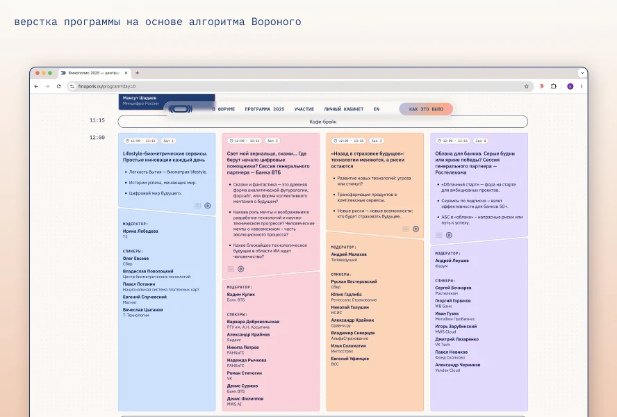
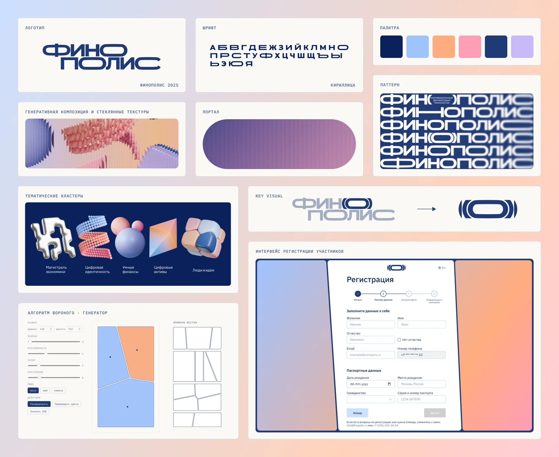
The first is rational: geometry, large type, and a generative grid built on the Voronoi algorithm — a nod to the stability of the banking system. The second is technological: volumetric shapes and digital plasticity that track where fintech is going.
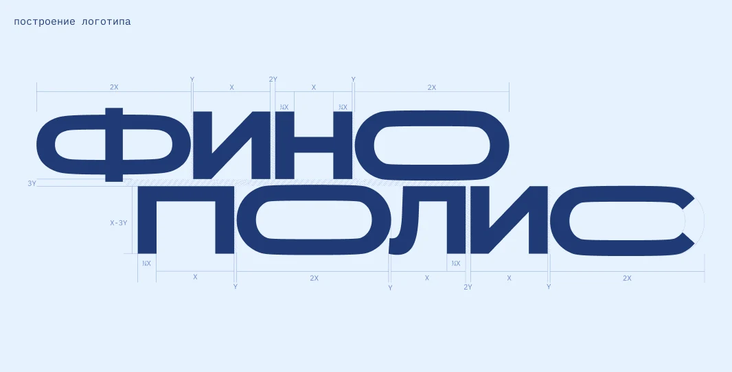
We drew Finopolis Sans — a geometric grotesque with carefully tuned shapes.
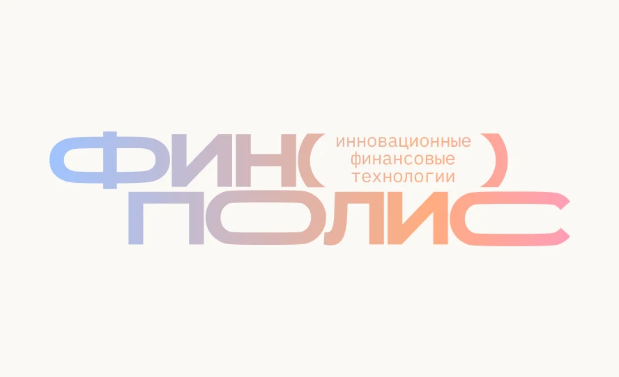
The logo is variable: it shifts from a compact mark to a full version.
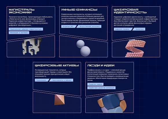
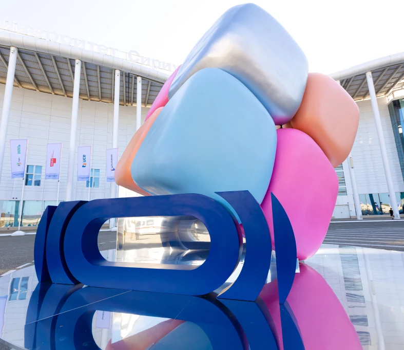
The technological layer of Finopolis went into 3D. Five clusters of the business program, five digital objects, each with its own character. We built a generative scene constructor that assembled compositions — changing light, motion, and angle.
The site opens with an intro to the anniversary: a geometric "10" morphs into the Finopolis logo.
From there you move through two layers. First a flat space with the forum's history, then a step into the 3D dimension of Finopolis 2025. Scroll works as navigation between layers: up, sideways, and into depth.
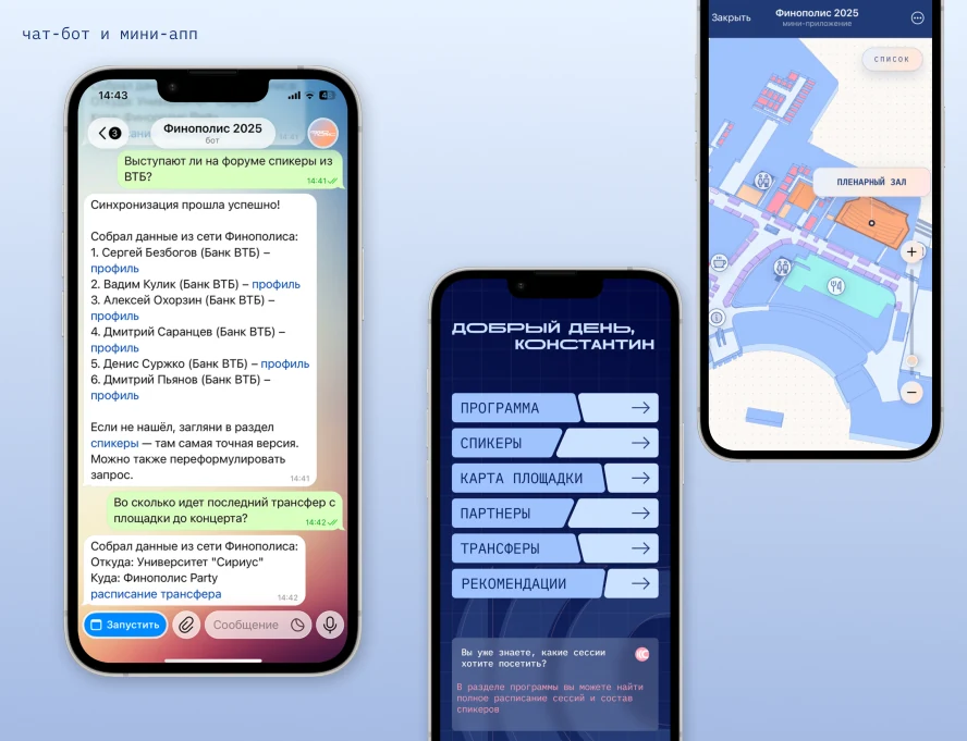
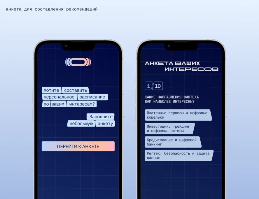
The participant's digital assistant is a bot plus a mini-app. Under the hood: a RAG architecture and natural-language processing.
The mini-app holds a personal schedule, on-site navigation, a catalog of speakers and partners, the program, and notifications.
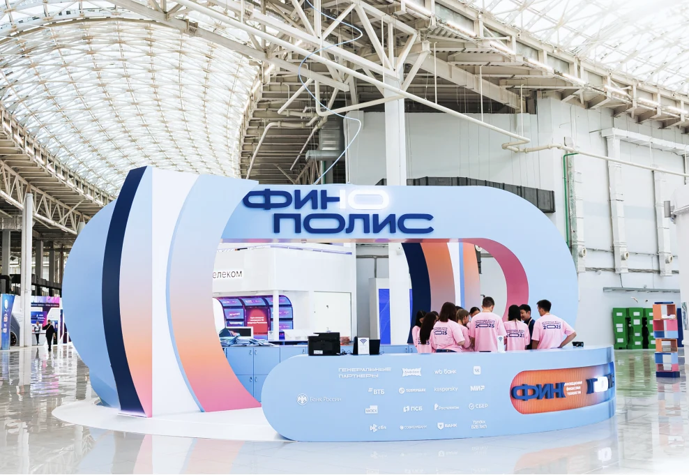
We made the decor with Formika: art direction on us, production and installation on them.
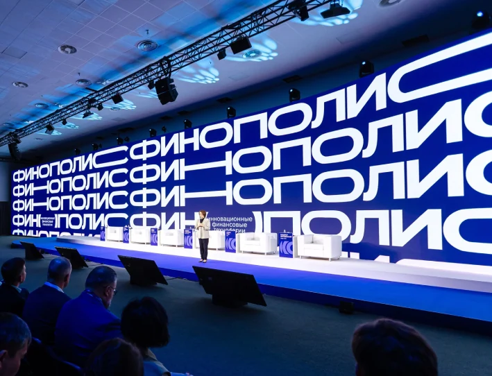
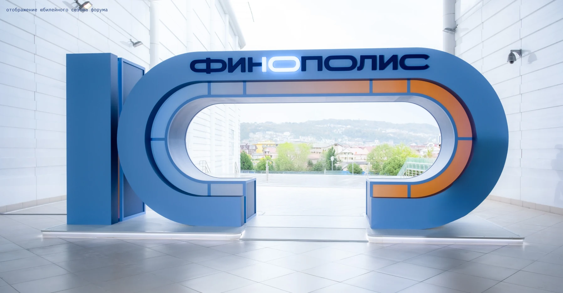
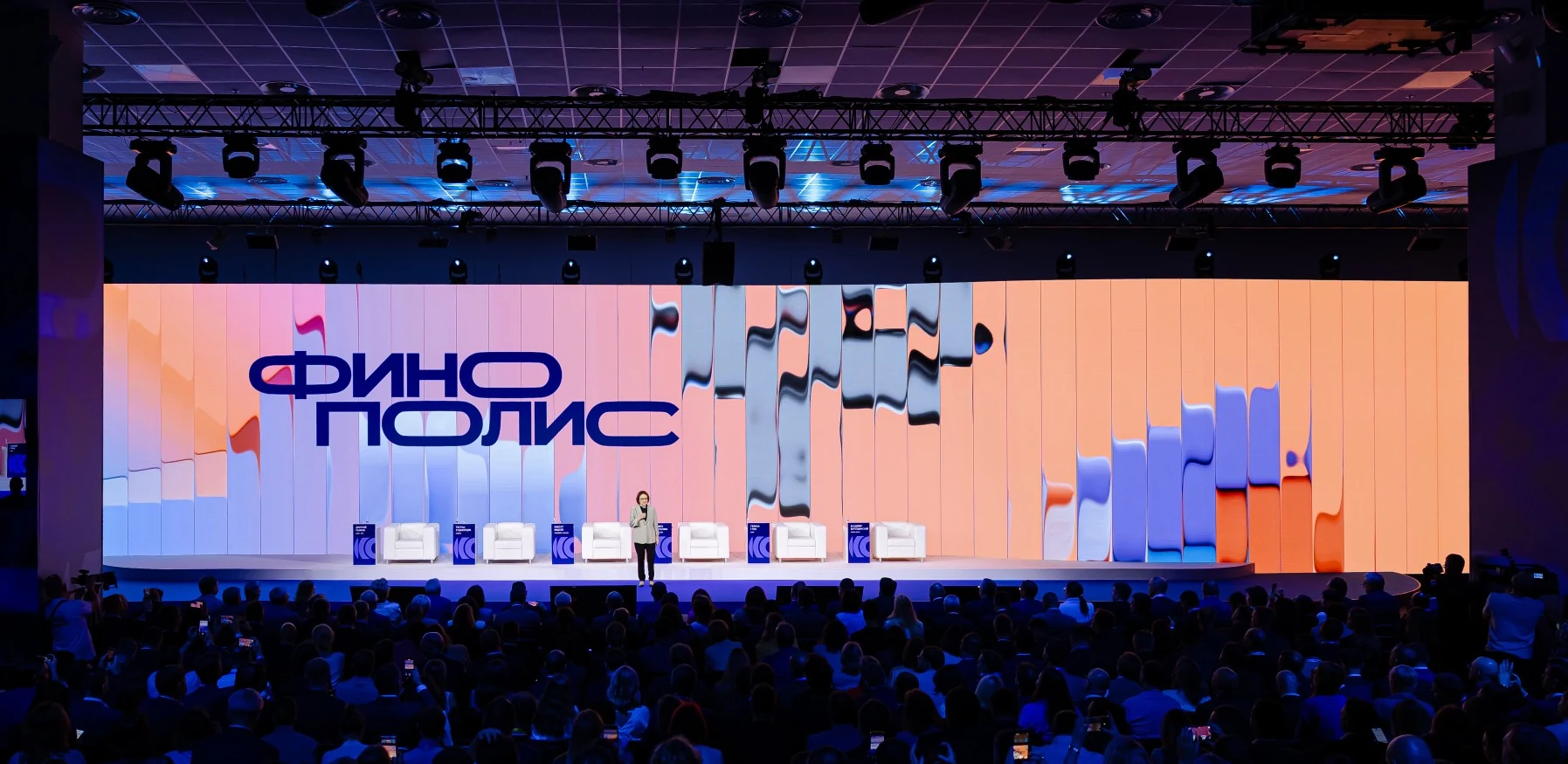
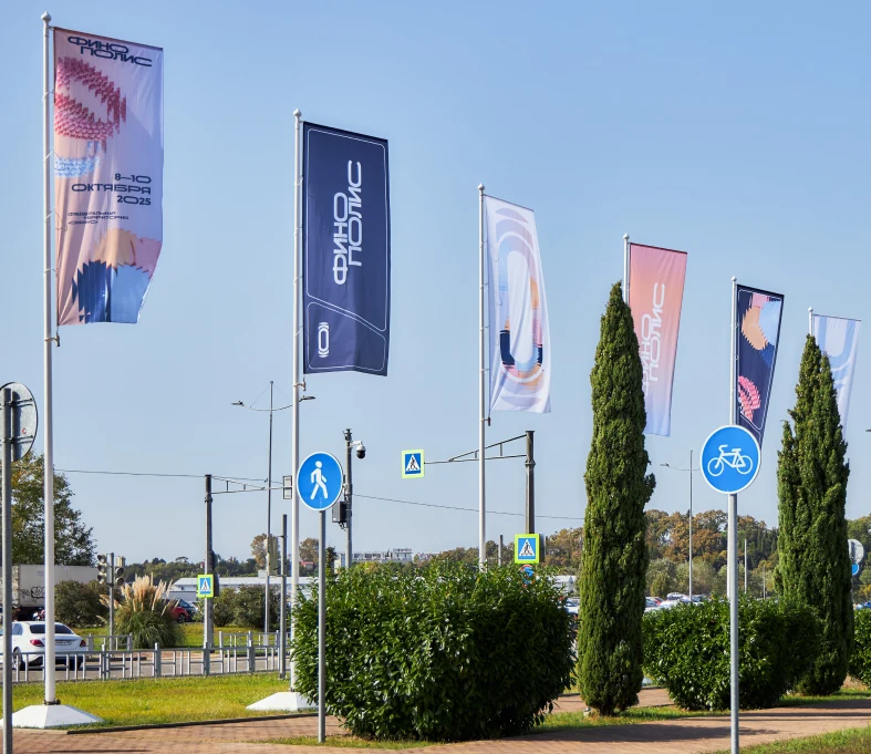
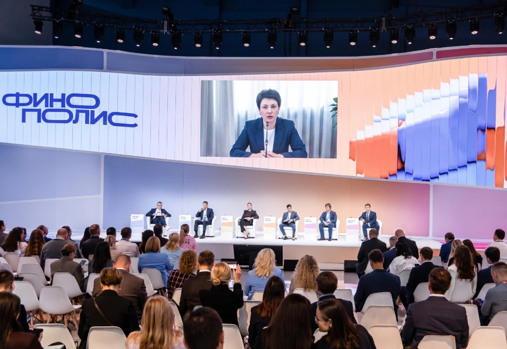
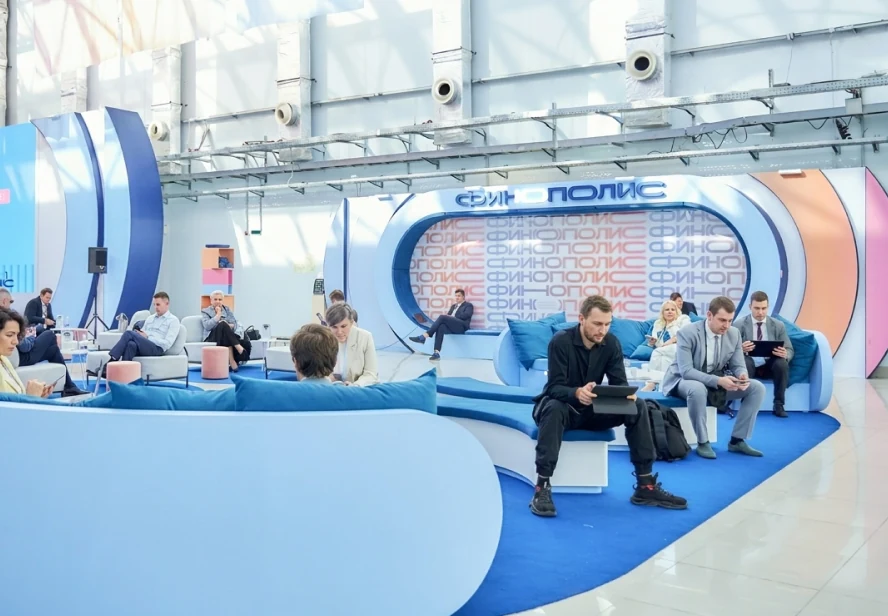
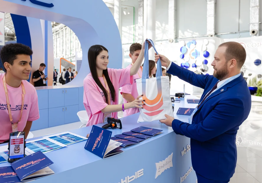
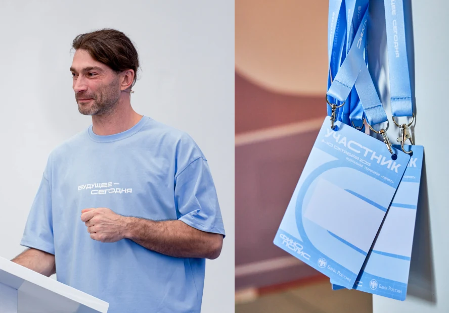
The forum space became an extension of the Finopolis digital environment. At the entrance, a large installation for the "People" cluster. The entry group is built as a portal.
Inside, elements from all five clusters are in play: 3D objects, light installations, media screens, and generative graphics.
Silver Mercury 2026 award for best event branding.
The forum's brand stopped being just a decorative layer.
1. A new visual language where digital, content, and space work as one system.
2. A seamless experience of the forum, from the digital environment to the physical space.
3. Finopolis set a new bar for how the Bank of Russia presents its business events — more technological, more whole.